By Taravat Morteza
Summary
A visual identity is more than a graphic expression. It is a system of meaning that reflects how an institution thinks, evolves, and communicates. In the case of Avicenna International College, the new identity was designed at a moment of transformation. After three decades of educational experience, the college had already evolved internally through new learning models, mentorship, and the integration of intelligent technologies.
The challenge was to translate this evolution into a clear and meaningful visual language. The new identity needed to reflect both heritage and future direction. It needed to feel structured yet open, academic yet human, international yet personal.
This article explains the thinking behind the new AIC logo and visual system. It explores the symbolic elements embedded in the design, including the initials, the bird, the book, and the idea of symmetry. It also presents the reasoning behind the new signature color and how it supports the overall identity.
The result is not simply a new look. It is a visual system that reflects how Avicenna understands education today.
Understanding Before Designing
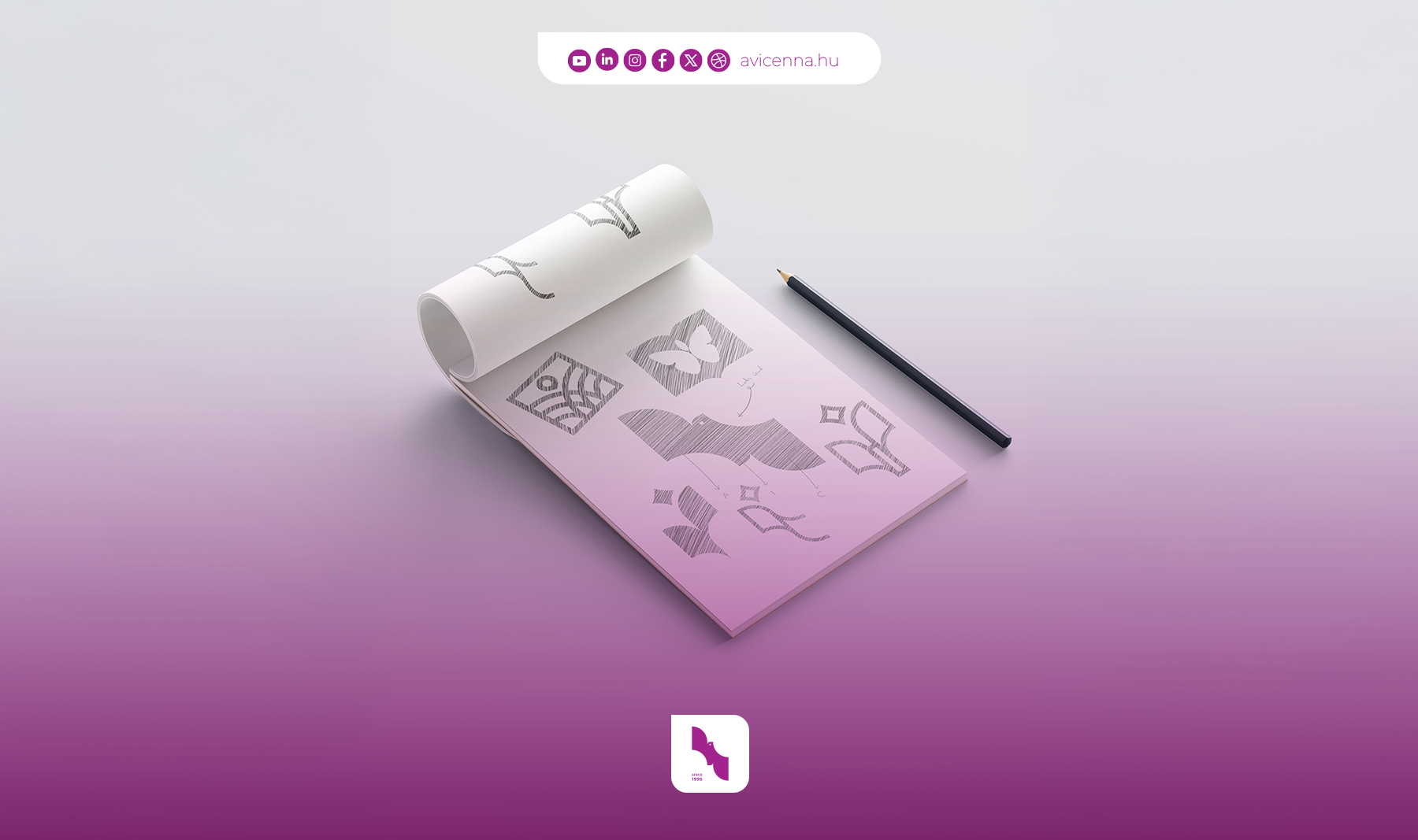
This project did not begin with drawing. It began with understanding.
Avicenna is an institution with history, responsibility, and emotional depth. It has educated thousands of students and built long-term trust across cultures.
The goal was not to redesign for the sake of change. The goal was to express more clearly what Avicenna has become.
During the process, one idea became central.
Avicenna is built on balance.
Balance between knowledge and growth
Balance between discipline and freedom
Balance between tradition and innovation
The visual identity had to reflect this balance in a simple and lasting way.
AIC as a Foundation of Identity
At the core of the logo are the initials AIC.
These letters anchor the identity in the name Avicenna International College. They create clarity and recognition. More importantly, they establish a direct and trustworthy connection between the symbol and the institution.
Rather than treating the initials as typography alone, they were integrated into the structure of the symbol. This creates a stronger sense of ownership and identity.
The result is a logo that is not abstract or disconnected. It is grounded in the name and meaning of the institution.
The Bird as a Symbol of Growth
One of the most important elements within the logo is the bird.
The bird appears in an upward movement. This is intentional.
It represents freedom, progress, and the idea of moving beyond limitations. It reflects the journey of students who arrive with potential and gradually develop the confidence to move forward independently.
The upward direction is essential. It expresses growth not as a concept, but as a continuous process.
At Avicenna, education is not about reaching a fixed point. It is about developing the ability to move forward.
The Book as a Symbol of Knowledge
Another key reference within the visual language is the book.
The book represents learning, wisdom, and the academic foundation of the college. It connects the identity to the long tradition of education and intellectual development.
At the same time, the book is not presented as something static or closed. It suggests openness and continuity.
This reflects the approach of Avicenna.
Knowledge is not something to memorize. It is something to explore, understand, and build upon.
Symmetry and Reflection
Symmetry plays a subtle but important role in the design.
It represents the relationship between effort and outcome. What is done today is reflected in the future.
This idea is central to education.
Learning requires consistency, discipline, and time. The results are not immediate, but they are shaped by continuous effort.
The visual balance in the logo reflects this principle. It creates a sense of stability, clarity, and intention.
A Unified Meaning
When these elements come together, the logo becomes more than a combination of forms.
The initials provide identity
The bird represents growth
The book represents knowledge
The symmetry represents effort and reflection
Together, they express a single idea.
Education as a structured, human, and evolving journey.
The Signature Color: Amaranth Purple
Color was a critical part of the identity system.
The chosen signature color is Amaranth Purple.
This color was selected for three main reasons.
First, it represents innovation and future thinking. Purple is widely associated with creativity, transformation, and new perspectives. It reflects the forward-looking direction of Avicenna.
Second, it creates distinction. Traditional academic institutions often rely on conservative color systems. This vibrant purple introduces a sense of confidence, originality, and leadership.
Third, it balances energy and professionalism. The color is strong and expressive, yet it remains refined and controlled. When combined with neutral tones, it creates a visual language that feels both dynamic and trustworthy.
This balance reflects the identity of the college itself.
A place with deep roots and a clear vision for the future.
Designed as a System
The new identity is not limited to a single logo.
It is a system that includes typography, layout principles, spacing, and digital behavior. Each element has been designed to support clarity and consistency across all platforms.
Consistency is what builds trust.
When every visual touchpoint feels aligned, the identity becomes stronger and more meaningful.
Looking Forward
The most important question during the design process was not how the identity looks today.
The question was whether it will remain relevant in the years to come.
Educational institutions require stability. At the same time, they must remain adaptable.
The identity of Avicenna was designed with this balance in mind.
It is clear enough to be recognized.
Flexible enough to evolve.
And meaningful enough to last.
Closing Reflection
The AIC logo is more than a symbol.
It represents a place where knowledge, growth, and human understanding come together.
A place where education is structured but not rigid
Guided but not limited
Rooted in experience but open to the future
Design, in this case, is not decoration.
It is a way of making meaning visible.
By Taravat Morteza
March 2026